(Click on paintings or drawings below to view larger size.)


Showing posts with label Copy. Show all posts

Thursday, January 11, 2024

Happy New Year 2024!

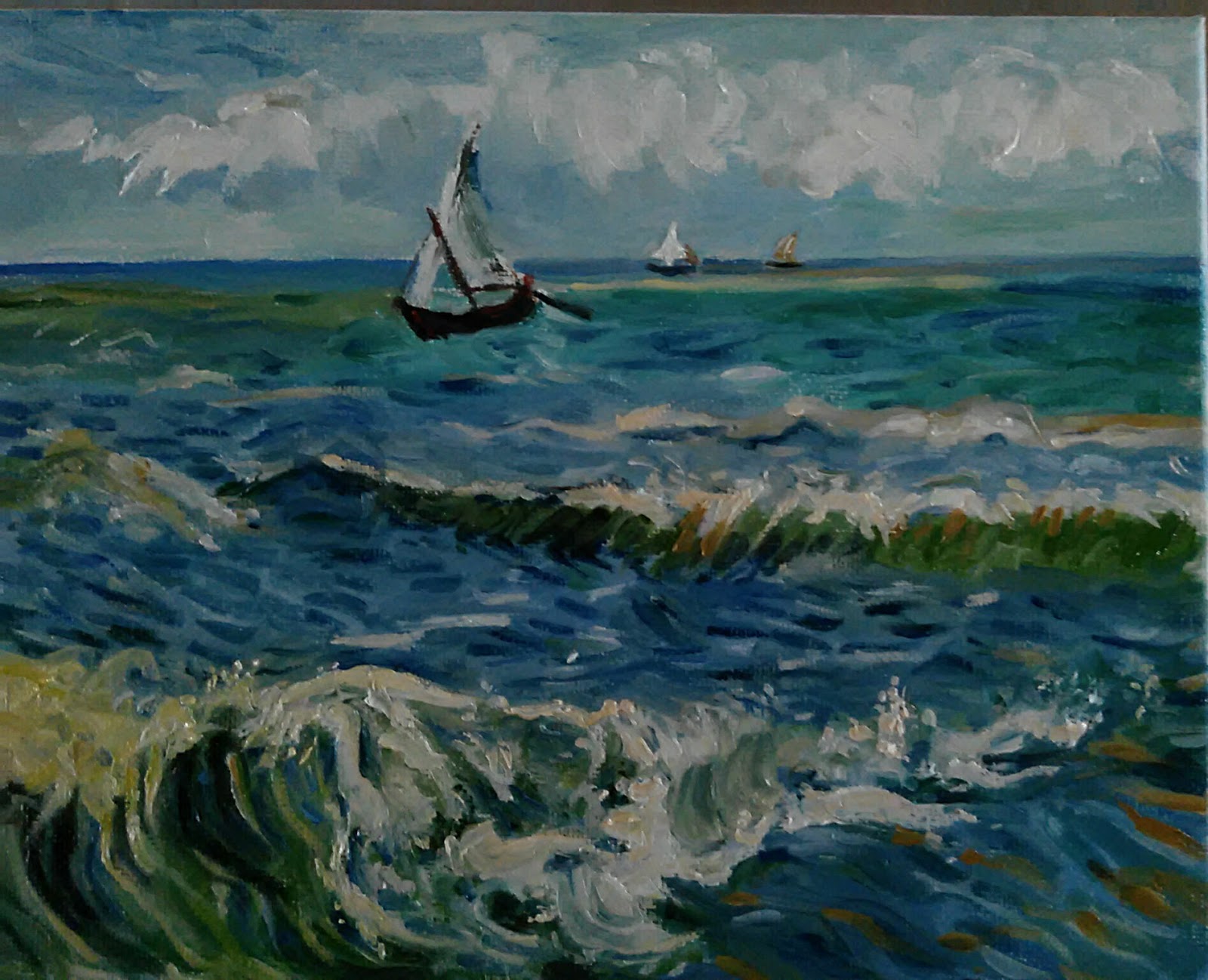
Copy of Van Gogh's "Mussels and Shrimp"
oil on 24x30cm canvas (his: 26.5 cm x 34.8 cm)

I wish everyone a happy and creative New Year!
 
This is a long overdue post after a busy fall. First, I see that I never posted my copy of Van Gogh's shrimp painting. It intrigued me and I happened to have a suitable canvas ready, so wanted to try those color combinations -- just to see for myself how they felt -- dark browns, golden ochres, some black, reds, the grey blue of the mussels... I find these copying exercises fun, like somehow connecting with Van Gogh. The original is not much bigger. It's from his Paris period in 1886. According to the VG Museum site, Gauguin later wrote that Van Gogh sold this painting to a dealer for 5 francs but immediately gave the cash away to a poor woman in the street. I think Van Gogh sold more paintings than we are led to believe.

More recently I started examining some works by Monet that I'm less familiar with. It's usually the paintings that are in private collections or smaller museums that don't turn up in my art books. It's refreshing to look at those, as opposed to the famous ones that have unfortunately been on my calendars, crayon boxes, notebooks, and so forth, nearly to the point of nausea.
 
Below are three copies on postcard canvas. I will put them in the mail as soon as they dry. I always send postcards without envelopes so they are postmarked and show signs of travel. I've already successfully sent this format to France and the UK. But I'm not sure if all postal services accept them because they are thicker than regular postcards.
 
First, a more conventional Vétheuil painting by Monet from the winter of 1879:


Then off to the Mediterranean in 1888. By then Monet had perfected his technique of painting several canvases at once, thus capturing all the different light effects during the course of the day. But in his letters to his wife, he tells how he struggled to get used to the colors of this new environment, so different from the Brittany coast. He also had to take breaks due to rain or wind or even excessive heat. Sometimes he was frustrated to find the scene had changed so much by the time he returned that he had to wipe off the paint and start over.

 
Finally, today I couldn't resist trying a completely different color scheme. My postcard copy of Monet's "Grove of Olive Trees in Bordighera" (1884):


All three are oil on 10x15cm postcard canvas panels. Now who will I send these to?

Thursday, November 17, 2022

Quelque Chose de Monet

"Quelque chose de Monet"
60x70cm, oil on canvas

At the start, this was going to be an exact copy of Monet's "Belle-Ile, rochers de Port-Goulphar". I discovered this series in Denise Delouche's book: "Monet à Belle-Ile". I'd never read such a thorough analysis of Monet's working methods. She includes photographs of the locations he painted so you can see exactly how he interpreted what he saw.

After all my tiny ACEOs, and after watching a documentary on the American abstract painter, Joan Mitchell, I felt the urge to paint big: Arte Documentary on Joan Mitchell

So I prepared a 60x70cm canvas with some extra gesso (the original Monet is a close 65x81cm), selected large brushes and started this with Cobra water-soluble oil paints. For my initial sketch, I tried not to resort to turps or odorless mineral spirits (which, I've learned, also produce toxic fumes even if you can't smell them) but the Cobra idea didn't work. The paint was still oily when I applied the next layer. So I wiped it away with a cloth and just used regular oil paint, applied as thinly as I could. Later I added more linseed as needed. As I progressed I found I liked the airiness of the unfinished copy so I put the book down and just touched up here and there.  

Some notes on Monet's palette:

It's difficult to judge colors from a photograph in a book but I read on line that Monet once revealed his palette: Flake White, Cadmium Yellow, Vermilion, Deep Madder, Cobalt Blue, Emerald Green. Of course, this is a translation which can lead to confusion (ref: Monet by Himself, by Richard Kendall, MacDonald & Co, London, 1989). I'd rather read this in the original because I've learned that the French "Emeraude" is sometimes translated as "Emerald Green" but is in fact "Viridian." Emerald green refers to Paul Veronese green. In any case, the point is that he used a limited palette. Interestingly, he stopped using black paint in 1886, which is the year he painted these boulders in Belle-Ile. I think I tend to mix ultramarine with alizarin to get close to black. But I thought I saw some green in the blacks in the water. Later I was surprised to read painters use green and alizarin to make black. I did that here without knowing. I would like to read "Monet by himself" but the reviews say he doesn't often talk about his technique.*

Working on a canvas nearly the same size as the one Monet used in the field brought me closer to understanding his methods. I could almost feel his concentration and enjoyment, as he strove towards the outer limits of what was then acceptable in the art world and also the urgency of finishing the painting in what must have been very uncomfortable conditions given the wind and ruggedness of the terrain. Wouldn't it be fun to visit Belle-Ile and paint there: Tourist office

--------------------------
added 9/5/23:

* I've since found a better resource for studying Monet's paint palette: Roy, A. 'Monet's Palette in the Twentieth Century: "Water-Lilies" and "Irises"'. National Gallery Technical Bulletin Vol 28, pp 58–68.
http://www.nationalgallery.org.uk/technical-bulletin/roy2007

Roy gives you the original French as follows: "Blanc d’argent, jaune cadmium, vermillion, garance foncée, bleu de cobalt, vert émeraude et c’est tout" 

As I suspected his translation is: "lead white,
cadmium yellow, vermilion, deep madder lake, cobalt blue and viridian". But he adds that this list may not have been accurate.

Monet's paint supplier recalled a different set of colors: "lead white, cobalt violet light, viridian, fine quality French (synthetic) ultramarine, vermilion (rarely), a trio of shades of cadmium yellow (light, dark and lemon-yellow) and another yellow pigment (outremer jaune citron), probably zinc yellow or a similar material"

An art dealer looked at his palette and reported "cobalt, du bleu d’outremer, du violet, du vermillon, de l’ocre, de l’orange, du vert foncé, un autre vert pas très clair, du jaune d’ocre, et enfin du jaune d’outremer. Au milieu, des montagnes de blanc des sommets neigeux."

In any case, Monet appears to have been annoyed at these questions about his palette, probably thinking an artist could create with whatever colors he had. But I thought I would investigate because I wondered how to best constitute a limited palette of high quality paint given the huge selection of colors available today.

Friday, June 18, 2021

“Le Pont Boïeldieu à Rouen, temps mouillé” d’après Pissarro


Pissarro started doing "series" paintings when he was 62 years old. He would rent a room with an interesting view and work on several canvases, studying various light effects and documenting urban life. I like his paintings of port activity in Rouen so tried copying this one to learn more about his technique. His dabs of paint expertly suggest people, horses, carriages, trams, windows, water, awnings, umbrellas, and so forth. The colors in my version are brighter than the reproduction I consulted but, in any case, it's difficult to get an idea of the true colors of a painting without having seen the original and this one is in a museum in Ontario.  
 
I was not aware of Pissarro's urban landscapes until I came across the book "The Impressionist and the City, Pissarro's Series Paintings," published on the occasion of an exhibit that was held in Dallas, Philadelphia and London in 1992-93. Until then, his series paintings had never been shown together as they are isolated in collections throughout the world. It's incredible that he painted over 300 of these urban views from 1892 until his death in 1903, yet he is known more for his earlier rural landscapes and experiments in pointillism. (An example is Pissarro's "Paysage à Chaponval" in the middle of my page: copies.)

Copy of "Le Pont Boïeldieu à Rouen, temps mouillé" by Camille Pissarro (1896)
Oil on 60x70cm canvas (the original is 73.7x91.4cm)

Sunday, January 17, 2021

Monet Therapy


I have some extra square canvases with matching frames so decided this Monet would be just the thing to get back into painting mode. The original is 200x201cm which must have been a completely different experience but I had fun concentrating on this small copy. It’s from the 1915 to 1919 period when he painted a series of large water lily canvases. By this stage his work was becoming increasingly abstract. I kept having to remind myself that these were lilies in a pond as I matched the colors and shapes.

“Monet Therapy”, copy of Monet’s water lilies
20x20cm, oil on canvas

Friday, November 27, 2020

La falaise à Dieppe, d’après Monet


Monet's cliffs are so extraordinary — you just want to go to the Normandy coast and apply paint the way he did back in 1882. The original Monet is 65x82cm while mine is much smaller.

“La falaise a Dieppe” d'après Claude Monet
22x27cm, Cobra oil on canvas

Wednesday, April 29, 2020

Time is Monet


I had the opportunity to participate in the Tour Elentrik Street Art project in Antwerp last week, where we relooked some of the electricity cabinets. The format was a big change from the ACEO 2.5x3.5inch cards I'd been painting recently. And working with acrylics on a street outdoors took some getting used to, given the wind, the virus (facemask, social distancing, etc), the cars driving by, and also the fact that I'd never used acrylics before. Hats off to street artists! Yet this was definitely a fun challenge that I wouldn't hesitate to repeat.

Here's the lily pond on the back:


And more flowers inspired by Monet on the sides, along with various frogs to add to the fun.


A final touch:


Find them all herehttps://streetartantwerp.com/

Monday, March 23, 2020

D'après Eugène Boudin


More practice painting skies with a beautiful sunset on the beach by Boudin. I bought a canvas nearly the same size as the original for this one but found out that Boudin used wooden panels so my copy is probably a bit more grainy than the original. Yet I am happy with the result and learned more about Boudin in the process. He painted many of these beach scenes with women in long dresses because they were popular among his clients. I can see that he really enjoyed painting skies. He probably had extremely fine brushes to get so much detail in the people. At first I found the faces mediocre but then read that the women were wearing veils to protect them from the elements so it makes sense that they are not clear.

Copy of Boudin's "Personages sur la plage, effect de soleil couchant" (1869)
27 x 45cm, oil on canvas (original is 29x47cm), varnished
(private collection, Madrid)

Friday, February 21, 2020

D'après Claude Monet


Copy of Monet's "Garden Path at Giverny" (1902)

30x30cm, oil on canvas
(private collection, Uccle)


Thursday, January 30, 2020

Monet, Van Gogh and Cézanne


Copy of Monet's "The House from the Garden" (1922)
30x30cm, oil on linen canvas panel

A splash of color to help get through the grey period we're experiencing in Belgium these days. I decided to finish this copy I had started back in 2014. It's part of a series of paintings by Monet. He depicts the path through the garden towards his house in Giverny but, during this late period, his approach has become less representational and increasingly abstract.


Copy of Van Gogh's "Vue de la mer aux Saintes-Maries de la mer" (1888)
8x10 inches, oil on canvas

I used a reproduction in a book as reference for this copy. Later, I was surprised to read that Van Gogh used a palette knife for this painting. But, in fact, I think he only used it to flatten out the top of the waves to make them shine, and maybe also to scrape two small areas on the middle wave so that the white grain of the canvas shows through producing a glittery effect. These are the details you miss when you haven't seen the original. Analyses have shown the painting is full of sand so it was definitely painted on location during a trip he made to the coast, which was just a half day's journey from Arles.


Copy of Cezanne's "La mer à l'Estaque" (1878-79)
30x30cm, oil on canvas
(private collection, Schaerbeek, Brussels)

And finally, ten years earlier, Cézanne painted this view of the sea. His simplified, nearly geometric elements are nonetheless challenging to reproduce given all the subtle variations in tone and color. The original is 73x92cm so I widened the foreground to make it fit on my square canvas.

Saturday, December 28, 2019

Two copies during Christmas break

Copy of Claude Monet's "Coucher de soleil sur la Seine, l'hiver" (1880)
(the original is at the Pola Museum of Art in Japan)
27x22cm, oil on linen canvas


During the holidays, I decided to explore the painting techniques of Marquet and Monet by painting two small copies. It's motivating to try out new subject matter; I've never painted sunsets or night scenes. Later I'd like to paint something "in the style of" these masters. I've heard there's a course that teaches art history this way and it seems like such a great idea.

For the Monet (above), I was working from a postcard without having seen the original painting. This means the colors and detail will not be exact yet it's still a good exercise. Not sure I'll ever find a similar icy scene myself but maybe I could paint a sunset over the North Sea some day.

Copy of Marquet's "Le Pont Neuf de nuit" (1937)
(the original is in Paris, France)
27x22cm, oil on linen canvas

Marquet's paintings are often "vues plongeantes" where you look down over a river or bridge that recedes diagonally towards the background. In this case, he tackled a rainy night with street lights reflected on wet ground. Of course, it would make sense to do this in a bigger format since the original is 82.5 x 100.5 cm. Nonetheless, it turned out to be a challenging exercise -- his paintings look deceptively easy.


Wednesday, June 12, 2019

"Le Déjeuner sur l'herbe" d'après E. Boudin


After over a year of Urban Sketching whenever I had a spare moment, there is nothing like copying an impressionist work to get back to oil painting. 

Eugène Boudin painted his "Déjeuner" in 1866 with the inscription: "à Mme Eug. Manet" (Edouard Manet's mother). He used a small wooden panel (17.5 x 25cm) and made certain references to both Manet and Monet's "Déjeuners":

This is based on a reproduction but the book left me wondering about the inscription. I googled all the dates. Boudin was 42 when he painted this, Manet's mother (Eugénie) was 55 and had lost her husband four years earlier. He must have meant her because the other possible Mme Eug. Manet, Berthe Morisot, only married Manet's brother (Eugène) in 1874 and hadn't even met him yet when this was painted.

In any case, copying Boudin's beautiful skies are the perfect exercise before the start of the summer landscape painting season.  

"Le Déjeuner sur l'herbe de Boudin" d'après E. Boudin
18 x 24 cm oil on canvas

Saturday, August 9, 2014

Late Monet (first stages)

Time to start painting again.

In Monet's later work, the subject matter practically disappears. Last time I had not painted in a while, I took a 30x30cm canvas panel and tried to recreate the colors from one of Monet's 1922 series, "The house from the garden":


"Impression of a Monet"
30x30cm, oil on canvas panel

I wouldn't call this a copy because I didn't follow the brushwork very carefully but it was a great loosening-up exercise. When I'm not painting every day, I need something like this to get back into it more efficiently.

Afterwards I worked on a small canvas I had started when the Virtual Paintout was in Croatia.  It's a far-cry from a Monet but I think what I accomplished was better than what it might have been without the start-up exercise.


"Croatian mountain landscape"
24x30 cm, oil on canvas

This time I was planning to select another Monet when I saw sunflowers on sale at the supermarket. The temptation was too great; I went out and bought a bunch.  Then, once you have cut flowers in the house, the clock starts ticking and there's no time to dabble in late Monet.


"Five sunflowers"
20x20cm, oil on canvas panel
(private collection, Brussels)


It took me a long time to get this to work because I started out too fast. I've been sketching recently and so I think I was looking for immediate results and failed to spend enough time planning the design. But a bouquet of sunflowers is so uplifting and motivating that you don't give up too quickly. In fact they are still in perfect condition so I'm off to try again from another angle.

Friday, April 22, 2011

Springtime

After trying to find the ideal spot to paint in Cape Town for the Virtual Paintout last month and finally giving up simply because time ran out, I'm now travelling "virtually" through Japan. This month's assignment is very difficult in the face of the tragedy that has overwhelmed that country. Yet I want to find something bright and positive with lots of colour. Right now I'm hesitating between a typical view of Mount Fuji or a street scene from Tokyo where Google seems to have captured yellow Gingko trees in the fall.

Meanwhile, I've been updating my "Copies of Famous Paintings" page. I've decided it's time to dust off everything I have on my walls -- a sort of "Spring cleaning" before I get involved in painting again. The Cezanne below ("Le déjeuner sur l'herbe") was the first copy I'd ever painted at the museum. I signed up to be a "copiste" at the Musée de l'Orangerie back in 1986 and was allowed to paint on weekday mornings as long as I observed certain rules (for instance, the painting could not be the same size as the original).


My copy of Cézanne's "Déjeuner sur l'herbe"
30x40, oil on canvas

I was disappointed with this copy because the green paint cracked a bit in the upper lefthand corner, but it wasn't easy getting every painstakingly-placed brushstroke to look like it was freely applied. I was more careful with my next copies. Working at the Musée de l'Orangerie was great because it was quiet. Here's my second try (Claude Monet's "Argenteuil"):


My copy of Monet's "Argenteuil"
oil on canvas
(private collection, Boston)


My third museum copy was another Cezanne:


My copy of Cézanne's "Pommes et biscuits"
oil on canvas
(private collection, Paris)

See my "Copies of Famous Paintings" page for my next Cézanne, "Paysage au Toit Rouge", also copied at the Musée de l'Orangerie.


When I tried to paint a Georges de la Tour at the Louvre, I was in for a shock. Huge crowds shuffled past me daily as I worked, and at one point an entire class sat right down next to me while the professor gave a 20-minute lecture on the painting I was copying (including some commentary about my supposedly bizarre painting methods which didn't match medieval techniques!). Yet, working from the original is an exhiliarating experience which also makes you realise just how bad the colours are on most reproductions.


My copy of De la Tour's "Tricheur à l'as de carreau"
(private collection, Colming)