(Click on paintings or drawings below to view larger size.)


Monday, January 2, 2023

Instagram Challenges


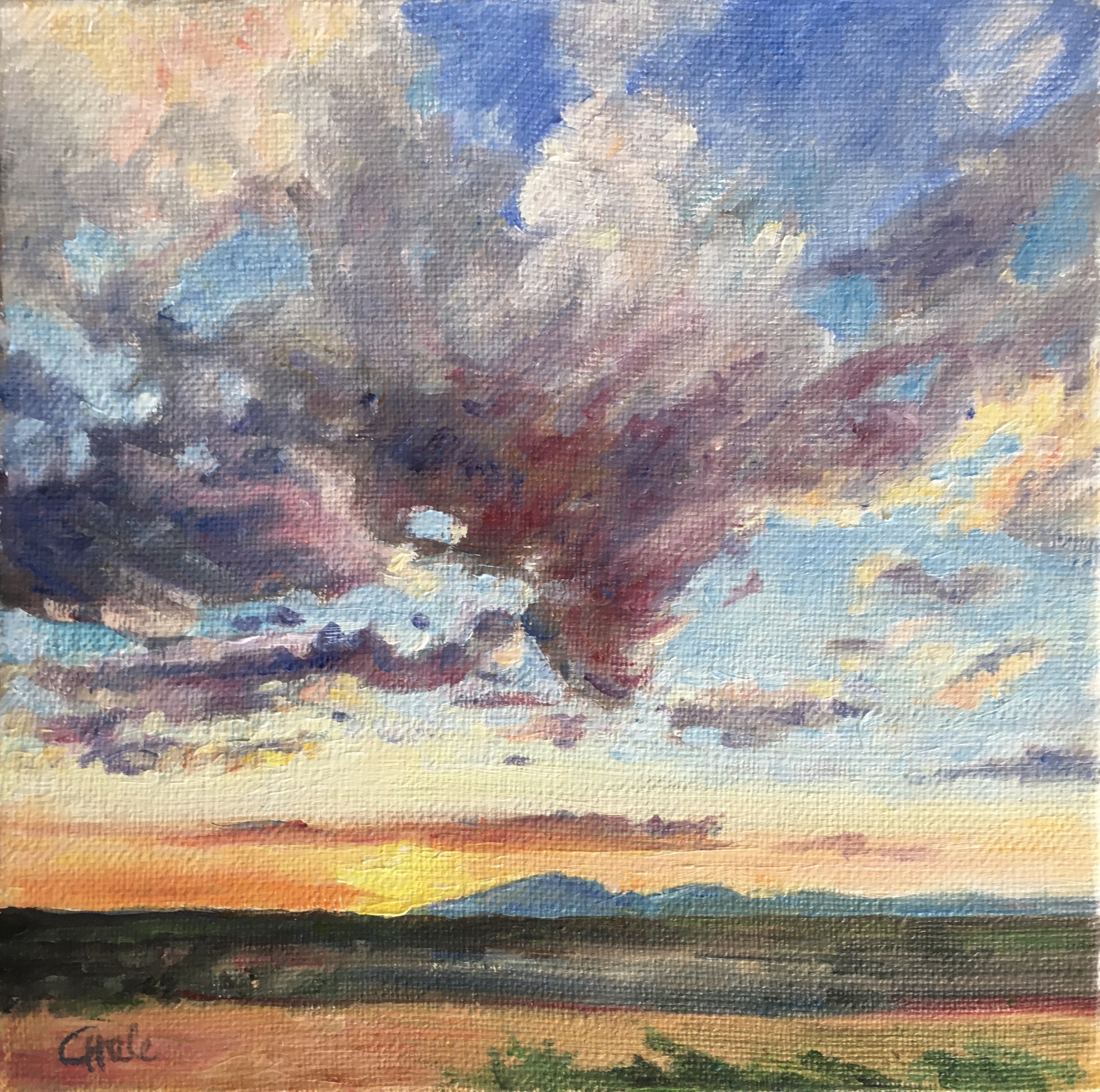
 "A Winter's Day"
12x18cm oil on canvas panel
inspired by a photo from the Landscape Art Club

I've been following three Instagram challenges that don't disappoint: @landscapeartclub, @foodpaintchallenge and @roomportraitclub. Unfortunately, last spring's @faceportraitclub seems to have disappeared. It takes a while for my oil paintings to dry so I missed sending out the postcard below:

"Christmas at Windsor Castle"
15x10cm oil on postcard canvas
inspired by the Room Portrait Club

This will be for Christmas 2023. 

Roaming the Internet to find subjects I haven't yet had a chance to paint whiles away these cold, dark days of winter. Here's some more snow thanks to the Landscape Art Club:


 "Canadian Trail"
10x15cm oil on canvas panel


"Yellow Lilies"
15x10cm oil on postcard canvas
(private collection, Schaerbeek)

The lilies were another popular subject at the Landscape Art Club. I painted some as ACEOs as well. Find those and my Food Paint Challenge work here: Smallest Paintings Gallery.

Looking forward to more of these in 2023! 

Happy New Year!


Friday, December 2, 2022

Les falaises d'Etretat

"L'aguille d'Etretat"
30x30cm oil on canvas

I couldn't resist painting another view of the iconic cliffs at Etretat. Since rock formations on the Normandy coast usually have names, I did some research. To my surprise, I found videos of some recent landslides near Etretat. Here -- YouTube -- a young photographer caught some of the action on camera. The town mayor is worried there could be more rocks falling and points out some crevasses in the cliffs. On another video, an expert explains that the entire Normandy coast is threatened by the phenomena, partially caused by global warming.

More on the cliffs:  les falaises tourism


Wednesday, November 30, 2022

Etretat


"Etretat"
40x40cm oil on canvas

There's a Landscape Art Club on Instagram that published some photos of Etretat this week. I've always dreamed of painting there. Well, this was the next best thing: exploring another of Monet's haunts via the Internet. Again, I wanted to stay away from turps. So this is nothing but oil paint and linseed oil. I tried to keep it loose while putting more texture on the surface and used a variety of paint brands -- all the odds and ends that have found their way into my paintbox. For instance, I discovered that the weird Rowney Georgian "flesh tint" was useful on the cliffs. I'm happy with the way this one turned out. 

Thursday, November 17, 2022

Quelque Chose de Monet

"Quelque chose de Monet"
60x70cm, oil on canvas

At the start, this was going to be an exact copy of Monet's "Belle-Ile, rochers de Port-Goulphar". I discovered this series in Denise Delouche's book: "Monet à Belle-Ile". I'd never read such a thorough analysis of Monet's working methods. She includes photographs of the locations he painted so you can see exactly how he interpreted what he saw.

After all my tiny ACEOs, and after watching a documentary on the American abstract painter, Joan Mitchell, I felt the urge to paint big: Arte Documentary on Joan Mitchell

So I prepared a 60x70cm canvas with some extra gesso (the original Monet is a close 65x81cm), selected large brushes and started this with Cobra water-soluble oil paints. For my initial sketch, I tried not to resort to turps or odorless mineral spirits (which, I've learned, also produce toxic fumes even if you can't smell them) but the Cobra idea didn't work. The paint was still oily when I applied the next layer. So I wiped it away with a cloth and just used regular oil paint, applied as thinly as I could. Later I added more linseed as needed. As I progressed I found I liked the airiness of the unfinished copy so I put the book down and just touched up here and there.  

Some notes on Monet's palette:

It's difficult to judge colors from a photograph in a book but I read on line that Monet once revealed his palette: Flake White, Cadmium Yellow, Vermilion, Deep Madder, Cobalt Blue, Emerald Green. Of course, this is a translation which can lead to confusion (ref: Monet by Himself, by Richard Kendall, MacDonald & Co, London, 1989). I'd rather read this in the original because I've learned that the French "Emeraude" is sometimes translated as "Emerald Green" but is in fact "Viridian." Emerald green refers to Paul Veronese green. In any case, the point is that he used a limited palette. Interestingly, he stopped using black paint in 1886, which is the year he painted these boulders in Belle-Ile. I think I tend to mix ultramarine with alizarin to get close to black. But I thought I saw some green in the blacks in the water. Later I was surprised to read painters use green and alizarin to make black. I did that here without knowing. I would like to read "Monet by himself" but the reviews say he doesn't often talk about his technique.*

Working on a canvas nearly the same size as the one Monet used in the field brought me closer to understanding his methods. I could almost feel his concentration and enjoyment, as he strove towards the outer limits of what was then acceptable in the art world and also the urgency of finishing the painting in what must have been very uncomfortable conditions given the wind and ruggedness of the terrain. Wouldn't it be fun to visit Belle-Ile and paint there: Tourist office

--------------------------
added 9/5/23:

* I've since found a better resource for studying Monet's paint palette: Roy, A. 'Monet's Palette in the Twentieth Century: "Water-Lilies" and "Irises"'. National Gallery Technical Bulletin Vol 28, pp 58–68.
http://www.nationalgallery.org.uk/technical-bulletin/roy2007

Roy gives you the original French as follows: "Blanc d’argent, jaune cadmium, vermillion, garance foncée, bleu de cobalt, vert émeraude et c’est tout" 

As I suspected his translation is: "lead white,
cadmium yellow, vermilion, deep madder lake, cobalt blue and viridian". But he adds that this list may not have been accurate.

Monet's paint supplier recalled a different set of colors: "lead white, cobalt violet light, viridian, fine quality French (synthetic) ultramarine, vermilion (rarely), a trio of shades of cadmium yellow (light, dark and lemon-yellow) and another yellow pigment (outremer jaune citron), probably zinc yellow or a similar material"

An art dealer looked at his palette and reported "cobalt, du bleu d’outremer, du violet, du vermillon, de l’ocre, de l’orange, du vert foncé, un autre vert pas très clair, du jaune d’ocre, et enfin du jaune d’outremer. Au milieu, des montagnes de blanc des sommets neigeux."

In any case, Monet appears to have been annoyed at these questions about his palette, probably thinking an artist could create with whatever colors he had. But I thought I would investigate because I wondered how to best constitute a limited palette of high quality paint given the huge selection of colors available today.

Plein Air in Antwerp - Summer 2022


"Antwerp Skyline"
12x22cm, oil on linen canvas
(private collection, Barcelona)
 
"Het Kempischdok"
20x30cm, oil on canvas panel

"The Bird House"
20x25cm, oil on canvas

I had fallen behind on posting my paintings from the summer. These were all "plein air" in Antwerp. The city skyline is visible from the other side of the Scheldt -- just go to the big ferris wheel and take the free ferry to cross the river. The Kempischdok can be reached with the No.1 tram (stop "Antwerpen ZNA Cadix"). According to Google Maps, the boats in my painting must be from the "Antwerpse Yacht Club". Finally, the Bird House is from the Antwerp Zoo where it's possible to get a yearly pass so you don't pay 30 euros each visit. I brought a stool to paint this location whereas my previous painting ("Day at the Zoo") was painted from a park bench.

"Plein air" painting is a fun challenge: juggling paints, canvas and brushes during changing light and weather conditions. I'd like to do it more often to really get the hang of it and thought I'd start a Facebook group to find other interested painters here (search "Plein Air Painters of Antwerp" on Facebook to join). However, now it's colder and raining out so I might have to wait until spring to start promoting this. Planning group outings might be difficult because you never know very far ahead of time whether it will be raining or not but at least this could be an on-line platform to share our work. In Brussels there's a meet-up group but it seems they haven't been active since 2019. When the weather gets better we could try to relaunch that one too.

The Blooming Garden

"Time for the Hollyhocks"
25x25cm oil on canvas panel

Last summer, I continued my project of painting all our garden flowers. I'm not yet bored of sitting in the sun, observing and painting the variety of colors and blooms: budding, flowering, fading, dried out, gone to seed... At the same time, I'm determined to use all the small canvases I've accumulated. I've also been avoiding solvents so these are painted with Rosa Gallery Oil Paints and Linseed oil ("raw" for cleaning the brushes and "purified" as a medium). 

Below is my  4x4 inch collection:

"Fucshia Bells"
12x12cm, oil on 3D grey canvas

"Pink Kisses"
12x12cm, oil on 3D grey canvas
(private collection, Horsham, UK)

"Wild Roses"
12x12cm, oil on linen canvas

"Purple Petunias"
12x12cm, oil on linen canvas

Regal Pelargonium”
12x12cm, oil on linen canvas

Sometimes it's not easy identifying the flowers. Geraniums are more confusing than I thought. In fact many of them are actually pelargoniums. Here's where I found the above pink-orange blooms: GardenTags


Monday, August 15, 2022

Postcard canvas


"Arches National Park"
10x15cm, oil on postcard canvas
(private collection, France)

When Yvonne Resol LaMendola posted a photo of Arches National Park in the Landscape Reference Photos for Artists Facebook group, I immediately saved it in my « to paint » folder. Then last week, my first order of blank postcard canvas panels arrived from Le Géant des Beaux Arts so I decided to try them out using her reference photo. The postcard canvas works well with oil paint. I just wonder how this will survive in the mail. B-post claims 5mm is their maximum thickness for a postcard so this just fits. I still need to make sure it's under the weight limit and then it needs to dry first before I can try mailing.


« In Grandma’s Garden »
15x10cm, oil on postcard canvas
(private collection, UK)

My second oil painting on a postcard is based on a photograph by Maggie Michaelowicz. I struggled to get the children’s expressions right on this tiny format. Maybe it’s time to invest in better paint brushes for this type of detail work.

Painting the Antwerp Docks


"Straatsburgdok, morning light"
25x32.5cm, oil on Figueras oil paper 

Arizona sunset

"Arizona Sunset"
Oil on canvas, 20x20cm
 

Friday, July 8, 2022

Rembrandt oil paints


« Australian Coastline »
18x24cm, oil on canvas, varnished

This is based on a photo by Karlien Goss-Ross in the Facebook group «Free reference photos for artists». I enjoy painting this type of rugged coastline. It was also a chance to try out my new set of Rembrandt oil paints - they came in a series of dark colors (the "Rembrandt" edition). I had forgotten how smooth these extra fine paints were. I also went back to odorless mineral spirits and a runnier medium than linseed. Yet I've since realised that odorless doesn't mean less toxic, so this is not the solution for studio work.